
HOW LONG HAVE NASA AND OTHERS
BEEN GIVING US THE BAD NEWS?
James Hansen, then Director of NASA’s Goddard Institute for Space Studies, testified before the U.S. Senate that global warming had begun. His testimony wasn’t speculation, and it wasn’t a warning about some distant future. It was a statement of fact; in 1988, global warming was already in progress.
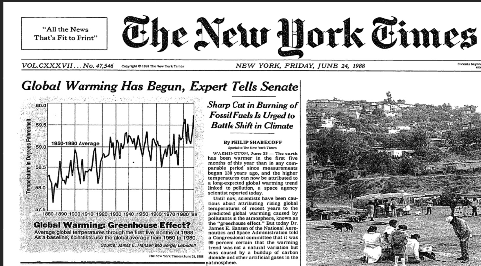
In brief, we, the public, were told in 1988 that our climate was already becoming hotter. So, the answer to the question above is “We have known the climate was already changing for nearly 40 years.”
Academic Researchers Came to the Same Conclusions.
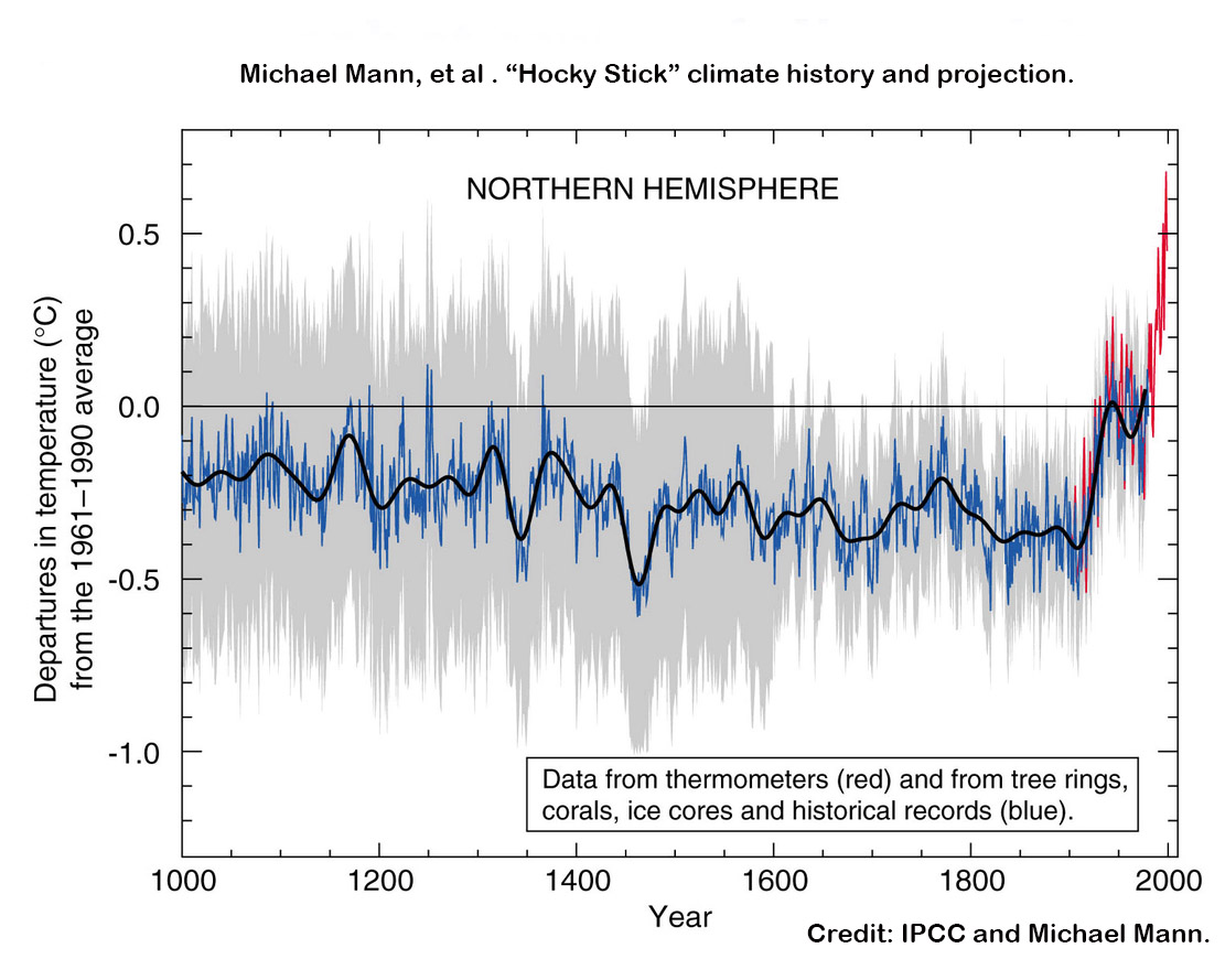
Using proxies for identifying past climate conditions.
Obviously, any temperatures claimed for the period before 1656 are somewhat speculative, but it is possible to make reasonable inferences. Temperatures before the invention of thermometers are not measured directly, but they’re not guesses either. Scientists use proxies, which are natural records that respond to climate in measurable ways. Tree rings, lake sediments, glacial ice layers, corals, and historical documents all contain signals that reflect environmental conditions of the time.
Tree rings make a good example. In years that are warm and wet, many trees grow wider, denser rings, while in cold or dry years, the rings are narrower or have different densities. During the modern period (when we have both tree ring data and thermometer records), we can see exactly how a tree responds to known temperatures. Identifying those tendencies in proxies permits us to create a calibrated scale. Once calibrated, the same patterns in older rings and newer rings can be interpreted as evidence of comparable climate conditions in the different samples.
Glacial ice layers work the same way in principle, but through different physical signals. Each layer of ice represents a year. The layer will have trapped tiny bubbles of ancient air and will contain specific ratios of oxygen, hydrogen, and other isotopes. Those isotopes shift in predictable ways with temperature. They can also pinpoint times of events (e.g., volcanic eruptions) by finding gases identifiable as volcanic. By calibrating isotope ratios against modern measurements, scientists can infer climate conditions for periods occurring long before instruments existed.
This is why reconstructions before 1656 are not speculative guesses. They are inferences grounded in calibrated physical relationships between the modern climate and climates of the distant past. Still, the farther back in time we look, the more uncertainty we will find, so researchers add a field of uncertainty (the gray areas in the chart) to allow readers to see the level of scientific certainty. USE OF PROXIES
The fossil fuel industry hated the chart.
At the time the article containing the chart was published, it was the most damning evidence of global warming to date. The evidence horrified the oil industry, and they (and their supporters) attacked the chart with all the vehemence they could muster. During the peak of these climate denial attacks, extremists even published the names of Mann’s children and the schools they attended. Although no harm came to them, the bullying of the children and death threats directed at the family ultimately forced them to move to a new, undisclosed location, underscoring the lengths to which opponents of climate science were willing to go to protect the oil industry.
Critics claimed that using proxies is unscientific. Using proxies to describe past weather, however, is accepted science (called dendrochrolology). If we consider that trees more than a thousand years old have been used for dating ancient structures for more than a hundred years, it is reasonable to accept these proxies as a valid model for the past, but this is done with the understanding that proxies are imperfect tools. They give us approximations and not specifics
The proxies gave them a great deal of information, but Mann and his team recognized that the proxies didn’t provide sharply focused information. They showed their level of confidence (or lack of confidence) in the early numbers by using gray areas (see them in the chart below). But their numbers after 1600 are less vague. What the numbers after 1600 show is a slow downward drift for 400 years. But beginning around 1850, the temperatures began to spike, and after around 1880 (once the average temperature of the Earth was established), their numbers skyrocketed.
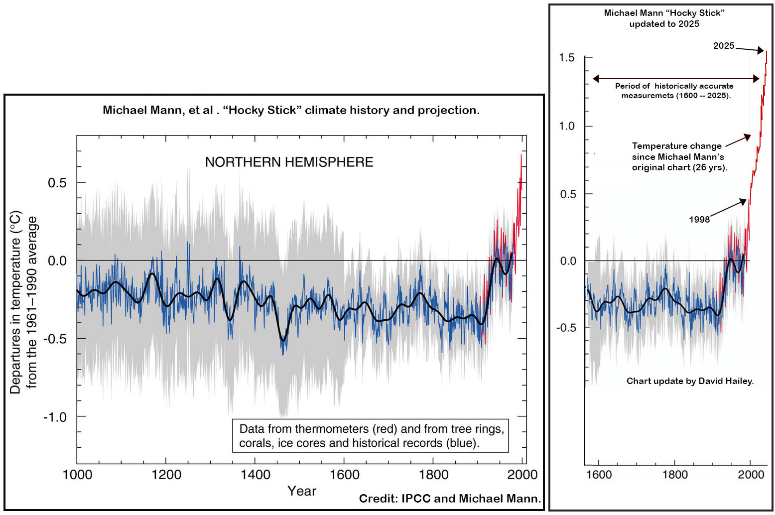
Their chart, however, ends in 1998 and so is not up to date. One thing we can do as individuals is find the numbers the scientists used to make the charts, and then reproduce the charts or update them. I took the liberty of updating it using NASA’s information (my chart is on the right). I only used the last 299 years of the Mann chart because that is the timeline after the invention of the thermometer. There is nothing left in this chart for the climate change deniers to cling to.
As I said earlier, their chart is called the “Hockey Stick” chart because it looks somewhat like a hockey stick lying on its back. My version of their chart looks more like a hockey stick leaning against a wall. I also mentioned earlier that we are in a slow-motion explosion, but we couldn’t see it because it was occurring in geological time. In my chart, you can see what the explosion looks like in a geological timeframe.
The explosion looks out of control, but it is not – at least not yet. If we stopped producing CO2 today, the explosion would run out of fuel and stop.
THE FUTURE LOOKS BAD, BUT IT'S NOT
This is where a normal book would give you all of the bad news and maybe make you feel bad for having done so little to curb climate change. Well, I am not going to do that, because the news is not so bad, and if in the past you tried to do your part in curbing climate change, you will already know there was not much you could do.
Why weren’t we buying EVs?
In the 1890s, if someone took a drive from Baltimore to Washington, D.C., it was not a road trip; it was an adventure. In 1890, you bought gasoline in quart jars at apothecaries and hardware stores, and cars had dismal gas mileage. Before 2026, driving an EV cross-country was a similar experience. EVs were expensive, and there weren’t enough places to charge them.
Worse, a bunch of absolutely nutty conspiracy theorists were so desperate to prove they were right that they made an ongoing practice of vandalizing charging stations. You never knew when you got to a charging station whether it would work. There was this thing called “range anxiety,” but people said “range anxiety” because it was harder to say than “terrified that when I get there, I will find all the chargers broken.”
So, we bought hybrid EVs by the boatload! It seemed like all of our liberal neighbors were driving hybrids. The truth is that there are many more of these cars on the road than we realize. Because they look like all the other cars, we don’t usually notice that they are hybrids as they go by.
On the other hand, we are at the beginning of a critical path into the future. All of those things I said in the previous paragraphs are no longer true. There are 93,000 charging stations in the U.S. today, and there will be twice that number in the near future. Range anxiety is a thing of the past. My new EV cost $28K. We are moving toward an amazing future of wonderful possibilities.
The truth is this: there is not much we could have done to curb climate change.
Frankley, in the past, there have been few good paths to a sustainable future. But now there are new paths opening up. In many of them, you can actually see where the path will take you, even as you step onto it. In this book, I will guide you to those paths and show what their destinations will look like. If we do everything right, the new future will be like comparing today to the beginning of the industrial age. My goal in this book is to introduce you to the amazing world your children and their children will live in, if we get it right.
And this introduces one vision of our future.
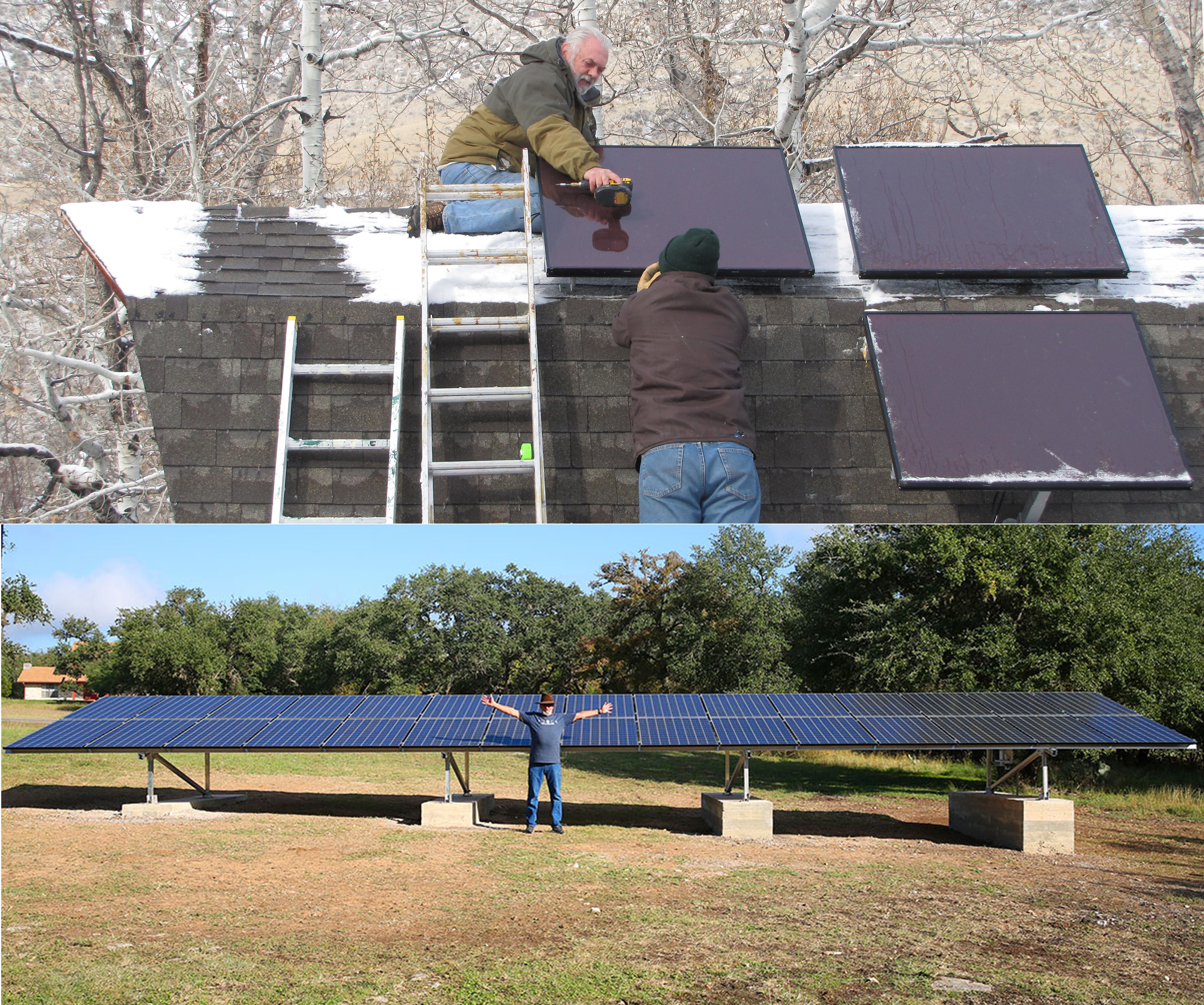
In 1999, I installed six 66W panels in an off-grid cabin in Idaho. The panels, inverter, four 12VDC marine batteries, and all of the wiring cost me an acre of creekfront property worth about $20,000. That’s six 66 Watt panels and four 12V marine batteries – $20,000! Moreover, I had to build a building to put the panels on and then install them myself.
In 1999, panels were not a good investment. We bought them because we had no access to the grid, and if we wanted to stay at the cabin for more than a few days, we needed electricity to run the water pump in our well. Under these circumstances, buying solar panels was like buying a car. In this cabin, we heated with a wood stove and used oil lamps for light, but we had running water and a working toilet.
The Age of Poor Choices is gone.
The 30 panels in the bottom image (above) make up to 350Wh each, and provide 10 kilowatts of power continuously during daylight hours for around 305 days a year. A rack of backup batteries keeps the house off the grid overnight until around 7:00 AM most mornings. The panels cost ~$29,000 installed, and it was a great investment.
To date, the panels have produced 153 million watts of electric power. I pay by the kilowatt-hour, so if I divide 153,000,000 by 1000, it gives me 152,990 kWh. My electricity payments are $ 0.16 per kilowatt, so I multiply by 0.16, I get $24,478 over 9 years. So my return on investment (ROI) is $2,720 per year. But there is more.
I filled my truck up about 3 times a month at around $100 each time. When I purchased an EV, I quit buying gasoline and began filling my car with free sunshine, which adds $3,600 to the $2,720 per year to equal $6,320 in savings per year (plus the reduced carbon footprint).
There is one more thing … the panels make much more electricity than we use, so we sell the excess to the grid. I have no idea what the return is on that, but that electricity that goes to the next house on the grid from ours. That house and our house are both using clean electricity from our array.
I bring this up for two reasons: First, in the past, buying solar was not a good investment, so the only justification for buying panels was reducing your carbon footprint. We need to be thankful for those who made that sacrifice. Unfortunately, until recently, panels were unaffordable for most of us, and they didn’t do much unless you bought a huge number of them. Now, under the right circumstances, they make a great investment.
Secondly, I wanted to give you a glimpse of a future where millions of homes have affordable solar power, batteries, and an electric management system that strengthens the grid. The more people who have solar and batteries, the more robust the electric grid becomes.
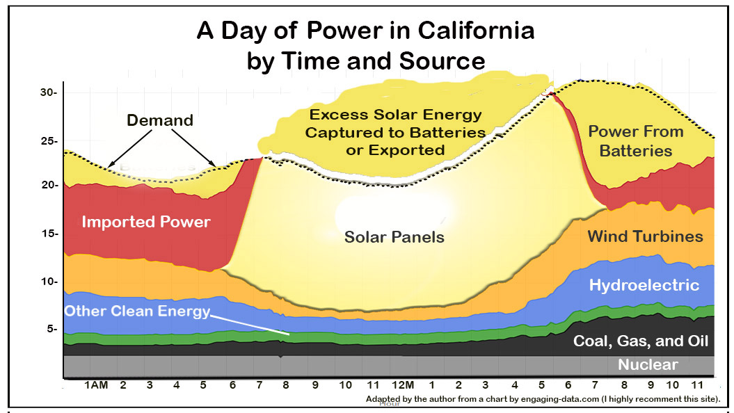
Here, we are seeing the future. Solar has already passed coal as an energy source in the United States, and its growth is exponential. The State of California has established the model that the rest of the U.S. can follow. Many more inexpensive arrays for those who can use them, and inexpensive batteries for the rest of us, creating a huge energy glut during the day, which we store in our batteries. We use the stored energy, and the utility taps the batteries as a resource to fine tune its management of the peaks and valleys of demand during the day
In 2024, during a huge heatwave, the Texas utility system warned its customers almost every day that there would be blackouts, but there never were. It turned out that there was enough privately owned solar to buffer the grid and prevent blackouts. This is a part of the future that is already here.