
POINT -- COUNTERPOINT
By now, it should be clear that the Earth is heating up, but then … maybe not. You might not be as comfortable with that claim as I am. Many who pick up this book will be less convinced that the Earth is experiencing human-induced climate change than I am, and the mandate “extraordinary claims require extraordinary evidence” applies as much to me as to everybody else.
According to NASA, 2024 was the hottest year in recorded history. Moreover, NASA claims even more heat records were broken in 2025:
- warmest ocean heat content on record,
- record high sea levels,
- and lowest winter Arctic ice … since satellite monitoring began.
1. NASA confirms,"2024 warmest year on record"
These are extraordinary claims, and such claims need extraordinary proof. Well, here is the topmost layer of their proof – a graph showing the average temperature of the Earth for every year since 1880.
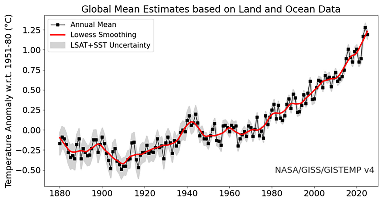
Note that global temperature rose in the 1930s and then unexpectedly dipped. Greenhouse gases such as CO₂, water vapor, NOx, and SOx were increasing, which pushed temperatures upward. But at the same time, heavy industrial activity produced large amounts of aerosols and particulate matter (visible smog). These particles scattered sunlight and brightened clouds, and over time their cooling effect temporarily overpowered the warming from greenhouse gases. This marks the point where particulate pollution (smog) reached its peak, and it was very visible. We worried a lot about that and demanded remediation. The government responded with mandates, and industries complied. The visible smog went away, but the invisible CO2 just kept growing. Slowly, the CO2 (and some other emissions) overpowered the downward trend, and it has been up and up ever since.
Not just NASA ... every major research center around the world is getting the same results.
I should point out that this data isn’t just from the United States scientific organizations. Many organizations around the world are taking these measurements at hundreds of thousands of points in the Arctic, Antarctic, and all the world in between. Their measurements come from ground-based weather stations as well as ships and buoys at sea. Moreover, NASA weather satellites verify the numbers, so, in effect, the temperatures of all those places are taken twice and those numbers compared. The National Oceanic and Atmospheric Administration (NOAA) collects the data, and NASA verifies it. In the end, there can be little doubt that the numbers are valid.
This evidence is compelling. It shows 55 years of uninterrupted climbing temperatures. Still, there are questions ...
- How is it possible to measure the temperature of the whole world and get an accurate average temperature, and have all of those millions of measurements be reduced to one number that represents the average temperature of the Earth for a given year?
- And how does anyone measure the Earth for a hundred and seventy-four years so accurately that they can confidently say “the Earth has warmed by 1.6ºC, on average, over that whole period?
- So what if the Earth has warmed 1.6ºC in the past 174 years? The temperature of the Earth warms or cools more than 1.6ºC during most any hour of any day.
One of NASA’s answers is …
Climate scientists focus on how the temperature has changed over time. For each individual station, they calculate how the temperature has strayed from an original baseline; these are known as anomalies. The baseline used is the temperature average from the 30-year period 1951—1980. Every location is measured against that 20th-century average. NASA Science
Well … that answer is about as clear as mud to me and probably to you, but perhaps with some research, I can produce a more understandable answer.
How do we know scientific measurements of the Earth’s temperatures are accurate?
First, I should point out that this data isn’t just from the United States scientific organizations. Many organizations around the world are taking these measurements at hundreds of thousands of points in the Arctic, Antarctic, and all the world in between. Their measurements come from ground-based weather stations as well as ships and buoys at sea. Moreover, NASA weather satellites verify the numbers, so, in effect, the temperatures of all those places are taken twice and those numbers compared. The National Oceanic and Atmospheric Administration (NOAA) collects the data, and NASA verifies it. In the end, there can be little doubt that the numbers are valid.
But to what extent can we trust the process of converting millions of daily measurements into a single, meaningful average temperature for the Earth over a year?
Understanding the terms
Baseline: NASA mentions “baseline” above but doesn't explain it, so I will. To understand how temperatures change over time, research organizations such as NASA, NOAA, Berkeley Earth, and others need to compare current temperatures to meaningful historical data (a baseline). To maximize accuracy, researchers use the averages of segments of time that are historically stable (some of these are 1850 to 1900, 1951 to 1980, 1981 to 2000). Because there are a number of agencies and time periods of interest, the agencies use different baselines for different purposes. The baseline NOAA uses is 1980 to 2000 to show recent changes, while NASA uses 1951 to 1980. In every case, each baseline is set to 0.00ºC. All temperatures collected, their relative positions are compared to those specific baselines.
Anomaly: A temperature above or below the baseline is called an “anomaly.” Anomalies are noted as -0.NºC for temperatures below the baseline and +0.NºC for temperatures above the baseline (N being the temperature’s actual number). Obviously, temperatures vacillate from year to year. Under normal circumstances, average temperatures would vacillate above and below the baseline for centuries, but if the lowest temperatures keep rising higher above newer and higher baselines indefinitely, the only assumption we can make is that the climate is growing warmer. In the case of NOAA’s 1981-2000 baseline in the chart below, the warmest average temperature passed above the baseline for the first time around ~1979 and the coolest average temperature passed above the baseline for the last time in ~1999. The anomalies passed through the baseline in around 20 years, and they never returned.
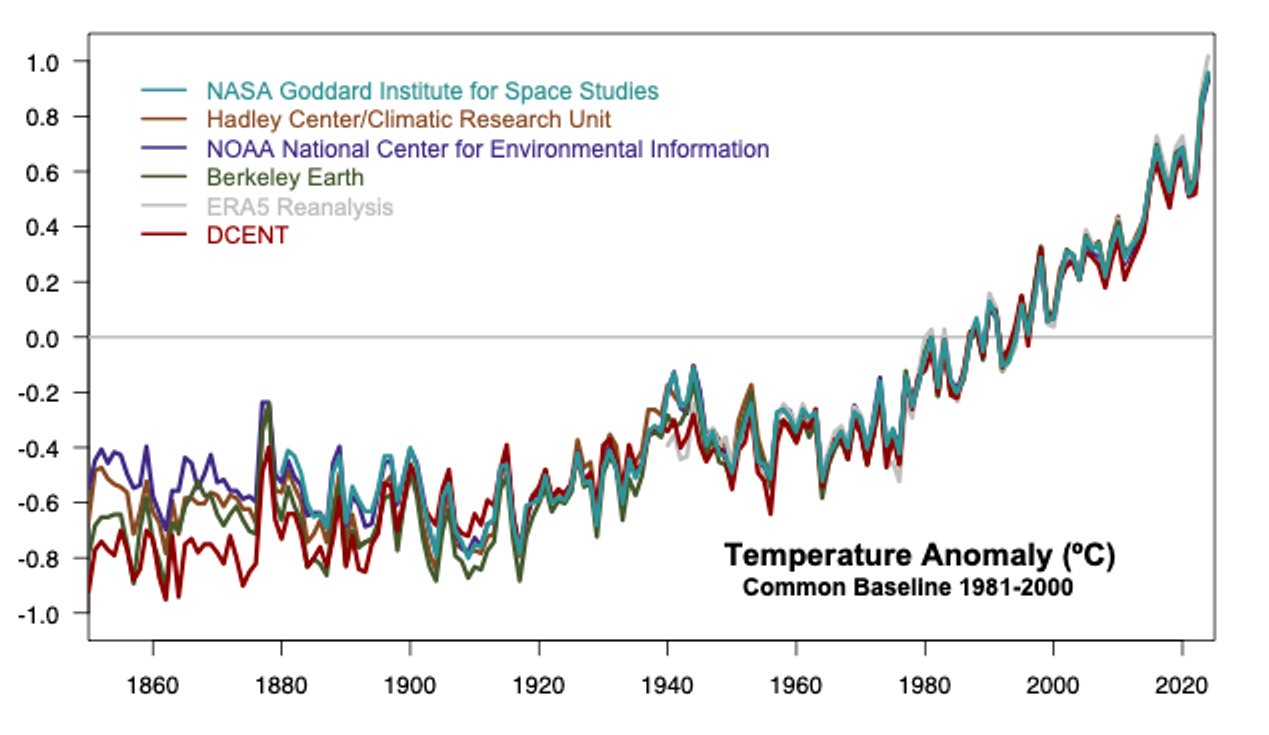
The math behind the chart is effectively a spreadsheet.
The averages in the graphs above seem compelling, but how do the researchers find those averages? If global temperatures rise above that baseline and continue to rise, the conclusion must be that the Earth is warming, and their math says the Earth's temperature has been rising since about 1965 (or 1890). So, “Are their calculations valid?”
Here is NOAA’s math in detail:
- First, their math for handling these numbers is not calculus or even advanced algebra. Their math is largely done in spreadsheet environments. With enough time and computing power, you could do this at home using Excel.
- There are tens of thousands of weather stations around the world — on land, on ships, on buoys, and in polar regions. These stations report temperatures to their national meteorological agencies, which then share the data with global systems such as NOAA, NASA, and the World Meteorological Organization.
- Weather stations measure daily temperatures, often reporting the day’s maximum (Tmax) and minimum (Tmin). Many modern stations also report hourly temperatures. Daily means are calculated either as the average of Tmax and Tmin or as the average of all hourly readings.
- National agencies collect and quality check the data, then send it to global archives such as NOAA’s Global Historical Climatology Network (GHCN) and the International Comprehensive Ocean–Atmosphere Data Set (ICOADS).
- NOAA does not simply average all station temperatures. Instead, it homogenizes the data (correcting for station moves and instrument changes), interpolates it onto a global grid, and computes an area weighted global monthly temperature anomaly.
- NOAA compares each month’s global temperature to a baseline period, producing a monthly anomaly. This is repeated for seasons and years.
- NASA does not receive NOAA’s averages. Instead, NASA independently downloads the same raw station data and applies its own methods to produce the GISTEMP dataset. The two agencies’ results are extremely similar because they use the same underlying observations.
- All datasets are continually updated as new or corrected observations arrive, improving accuracy over time.
- Although the processing involves millions of observations and sophisticated quality control steps, the underlying mathematics — averaging, subtracting, and weighting — is conceptually simple and could be reproduced in a spreadsheet on a much smaller scale.
What the results look like
The graph in Figure 2 shows a series of clear trends. I pointed them out earlier but didn’t explain what was causing the changes. For example, I mentioned that from 1850 until ~1919, global temperatures drifted slowly downward. That downward trend is because, having come out of the last ice age, we have been moving toward the next one for about three thousand years. The takeaway from this is that temperatures have been going down for thousands of years and should still be going down.
After 1919, the trend turned upward and continued rising until about 1945. As the Industrial Revolution ramped up, CO2 began overwhelming our drift towards our next ice age, and temperatures began to rise.
Between 1945 and the late 1970s, the warming trend stalled. This 1945 plateau was caused largely by heavy post war air pollution (especially sulfate aerosols) that reflected sunlight back into space and temporarily masked the warming trend, caused by greenhouse gases. Once clean air laws began reducing aerosol pollution in the 1970s, the underlying warming trend reemerged, and temperatures resumed their steady climb. They have been climbing ever since.
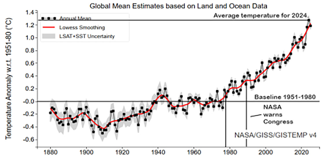
The baseline represents the average temperature for the years 1951 through 1980. As we have already noted, around 1977, the average temperature punched through the baseline for the last time. Once it passes through, there is plenty of reason to believe that it will fall back through the baseline at some point in the future. NASA watched the temperature climb for around ten years, then warned the United States Congress that it is tracking evidence of prolonged global warming.
How long have NASA and others been giving the U.S. public the bad news?
James Hansen, then Director of NASA’s Goddard Institute for Space Studies, testified before the U.S. Senate that global warming had begun. His testimony wasn’t speculation, and it wasn’t a warning about some distant future. It was a statement of fact; in 1988, global warming was already in progress.
In brief, we, the public, were told in 1988 that our climate was already becoming hotter. So, the answer to the question above is “We have known the climate was already changing for 36 years.”
I will speak much more about what the rest of the world is doing in a relevant segment of the book.